#install new packages for the animated plots
install.packages("gganimate")
install.packages("gifski")BIO00066I Workshop 4
Cell Biology Data Analysis Workshop 4
1 Learning objectives
Philosophy
- Workshops are not a test.
- Don’t worry about making mistakes.
- The staff are here to help.
1.1 Technical skills
Today, we will learn how to:
- Use a linear model to predict some y values, given some x values
- In our case we use absorbance (x values) to predict alkaline phosphatase activity (y values)
- Make animated plots with
gganimate
1.2 Thinking like a data scientist
It might seem like a lot of trouble to use R to read in a small number of x and y values from an Excel sheet to a standard curve, and then estimate some new y values. We could probably do this in Excel.
But what if we have 200 standard curves, and we want to automate the process? What if we have 50,000 x and y values and a non-linear model? For big data, R (or some similar software) is the only sensible way.
2 Introduction
2.1 The biology
2.1.1 Cell movement
We saw in workshop 3 that clone A moves faster than clone B. This time we will use R to explore MCS cell movement in more depth. Use x and y coordinates from manually tracked cells. We have 10 manually tracked cell lineages of clone A and 9 manually tracked cell lineages of clone B. Today, we will explore the ways these lineages move.
2.1.2 Osteogenesis and alkaline phosphatase assays
To help address our research question of whether morphology and migration can be used to predict MSC phenotype, we also need to investigate the ability of the two clonal lines to differentiate.
In Practical 3 you have examined their capacity to undergo osteogenesis (differentiate into osteoblasts - bone cells) when they are given an inductive medium. To recap:
- Cells that are undergoing osteogenesis will produce bone extracellular matrix, which contains a lot of the alkaline phosphatase enzyme
- Alkaline phosphatase catalyses the reaction of substrate para-nitrophenyl phosphate (pNPP) to para-nitro phenol (pNP)
- ie: pNPP -[alkaline phosphatase]-> pNP
So the amount of pNP produced is a proxy for the activity of alkaline phosphatase, and therefore the extent of osteogenesis in the cells.
2.2 Research questions
- Can we see differences in how clonal lines A and B move?
- How can we display this data visually?
- What is the osteogenic potential of clonal lines A and B (Part 1)
2.3 The data
2.3.1 Part 1: pNP absorbance values
In this section, we show how to use a linear model to predict pNP concentration from absorbance values using some example data. In your report, use your own data from Practical 3.
2.3.2 Part 2: manually-tracked cell movement ‘point’ data
The Livecyte data that tracked cells automatically was unreliable. In workshop 3 we looked at some manual tracking data.
This contained information like track.length, the meandering.index, euclidean.distance and so on. This time we look at manual data in its raw form: x and y coordinates of the cells, tracked over time. We will visualise the paths they take in the culture dish using animated plots. We may observe interesting patterns by studying this data.
3 Exercises
To quantify the concentration of pNP and therefore the activity of the enzyme in unknown samples we’ll create a standard curve of known values of pNP and then interpolate the unknown pNP values in our sample from this.
3.1 Setting up: installing packages and loading libraries
First, install the gganimate package. We will use this to create moving plots later.
Then load all the libraries we’ll need today.
# load libraries
library(tidyverse)
library(readxl)
library(ggpubr)
library(gganimate)
library(gifski)
3.2 Part 1: pNP absorbance values
First, we read in some data from an Excel file of some asmaple data.
You can obtain the example file BIO00066I-pNP-example-data-2025-26.xlsx from here.
Download this file and save it in your raw-data directory. If you don’t have a raw-data directory, make one.
3.2.1 The pNP standard curve
We’ll read in the standard curve data from the file BIO00066I-pNP-example-data-2025-26.xlsx.
Note that:
- we use
sheet=1to specify that we want the first sheet (or tab) - we use
skip=3to specify that we want to skip the first three lines (because they are comments, not data)
# read the standard curve data
# skipping the first three lines, and specifying the first sheet
pnp.calibration.data <- read_excel("raw-data/BIO00066I-pNP-example-data-2025-26.xlsx", sheet=1, skip=3)

#check what we have
view(pnp.calibration.data)
Then simplify the data with pivot_longer:
pnp.calibration.data.pivot <-
  pnp.calibration.data |>
  select(-mean.abs, -standard.deviation) |>
  pivot_longer(-pNP.conc, names_to = "rep", values_to = "absorbance")
view(pnp.calibration.data.pivot)
Reorder the columns, so it is more intuitive for us using relocate:
pnp.calibration.data.pivot <- relocate(pnp.calibration.data.pivot, absorbance)3.3 Plot enzyme data
Let’s make a simple plot, adding a line that shows the linear model with the line geom_smooth(method="lm"). The method="lm" means plotting a linear model.
#plot, saving the plot in an object called 'pnp.standard.curve.plot'
pnp.standard.curve.plot <- pnp.calibration.data.pivot |>
  ggplot(aes(x=absorbance, y=pNP.conc))+
  geom_point()+
  geom_smooth(method="lm")

#show the plot
pnp.standard.curve.plot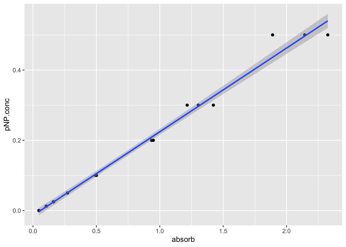
Now save the plot:
#save as a jpeg
#has a 'date stamp' (2025-03-21) in the name
ggsave("pnp-standard-curve.jpeg",pnp.standard.curve.plot,width=7,height=7)
3.4 Make a linear model
We can use the lm function to make a linear model. This is a simple model that assumes that the absorbance is linearly related to the pNP concentration. We can use this model to predict the pNP concentration of unknown samples.
# make a linear model so we can predict pNP concentration from absorbance values
pnp.linear.model <- lm(pNP.conc ~ absorbance , data = pnp.calibration.data.pivot)
Now we have the linear model, if we have some pNP absorbance values, we can determine the pNP product concentrations.
We have put some mock pNP values in the excel file BIO00066I-pNP-example-data-2025-26.xlsx, in sheet two. Read in sheet two of the file, skipping the first line (because it is a comment, not data). This sheet contains some mock data for the unknown samples. We will use the linear model to predict the pNP concentrations of these unknown samples.
# read in experimental pNP data for unknown samples, skipping the first line
pnp.experimental.data <- read_excel("raw-data/BIO00066I-pNP-example-data-2025-26.xlsx", sheet=2, skip=1)

#check what we have
glimpse(pnp.experimental.data)
Rows: 6
Columns: 7
$ day <dbl> 0, 0, 8, 8, 8, 8
$ clone <chr> "A", "B", "A", "B", "A", "B"
$ differentiated <chr> "N", "N", "N", "N", "Y", "Y"
$ absorb.rep1 <dbl> 0.106, 0.056, 0.358, 0.054, 1.365, 0.054
$ absorb.rep2 <dbl> 0.169, 0.055, 0.218, 0.058, 1.214, 0.056
$ absorb.rep3 <dbl> 0.137, 0.057, 0.131, 0.054, 1.227, 0.056
$ DNA_ug_per_ml <dbl> 2.902954, 2.140482, 3.915969, 4.892328, 2.498356, 2.814…Now we calculate the average for each of the three replicates using mutate. Note that mutate is a very useful function for creating new columns using existing ones. It can also join text columns. We can also use select after the mutation to remove the replicate columns.
pnp.experimental.data <- pnp.experimental.data |>
  rowwise() |>
  mutate(absorbance=mean(c(absorb.rep1,absorb.rep2,absorb.rep3),na.rm=T))
We named our mean absorbance absorbance because we specified the absorbance variable in the code pnp.linear.model <- lm(pNP.conc ~ absorbance , data = pnp.calibration.data.pivot) above. So our linear model is ‘looking for’ an absorbance variable to use.
4 Predict values based on a linear model
4.1 Apply our linear model to the mock data
In your project work, you will use the real data collected. But for now, we will use some mock data. We will use the linear model we created to predict the pNP concentration of the mock data.
Here is how to do it, using the predict function:
#calculate predicted pNP concentration using the linear model
predicted.pnp.conc <- predict(pnp.linear.model,pnp.experimental.data)

#add predicted pNP concentration as a new column
pnp.experimental.data$predicted.pnp.conc = predicted.pnp.conc

#check what we have
glimpse(pnp.experimental.data)
Rows: 6
Columns: 9
Rowwise:
$ day <dbl> 0, 0, 8, 8, 8, 8
$ clone <chr> "A", "B", "A", "B", "A", "B"
$ differentiated <chr> "N", "N", "N", "N", "Y", "Y"
$ absorb.rep1 <dbl> 0.106, 0.056, 0.358, 0.054, 1.365, 0.054
$ absorb.rep2 <dbl> 0.169, 0.055, 0.218, 0.058, 1.214, 0.056
$ absorb.rep3 <dbl> 0.137, 0.057, 0.131, 0.054, 1.227, 0.056
$ DNA_ug_per_ml <dbl> 2.902954, 2.140482, 3.915969, 4.892328, 2.498356, 2…
$ absorbance <dbl> 0.13733333, 0.05600000, 0.23566667, 0.05533333, 1.2…
$ predicted.pnp.conc <dbl> 0.0186305663, -0.0007477517, 0.0420592704, -0.00090…4.2 Normalise pNP concentrations
Each experiment will have a slightly different number of cells, and this will affect the amount of the para-nitrophenyl phosphate (pNPP) substrate, and therefore the amount of pNP product produced.
Why normalise?
Cells grow at different rates during osteogenic differentiation. For example, clone A usually grows slightly more slowly than clone B, and hMSCs grow faster in osteoinductive medium. So we need to normalise the results to cell number. Otherwise, a higher pNP concentration may simply mean there were more cells, not that each cell had higher alkaline phosphatase activity.
So we need to normalise these differences in growth rate. We can do this by dividing the predicted pNP concentration by the DNA concentration, because we know that cells do not gain or lose large amounts of DNA very often.
To achieve this, we can use the mutate function to create a new column in the data frame, pnp.experimental.data. We will call this new column normalised.pnp.conc. We will divide the predicted.pnp.conc column by the DNA_ug_per_ml column.
##divide the predicted.pnp.conc column by the DNA_ug_per_ml column
pnp.experimental.data <- pnp.experimental.data |>
  mutate(normalised.pnp.conc = predicted.pnp.conc / DNA_ug_per_ml)

# check what we have now
names(pnp.experimental.data)
[1] "day" "clone" "differentiated"
[4] "absorb.rep1" "absorb.rep2" "absorb.rep3"
[7] "DNA_ug_per_ml" "absorbance" "predicted.pnp.conc"
[10] "normalised.pnp.conc"4.3 Making a bar plot of predicted pNP concentrations
At this point, pnp.experimental.data has grouping columns (day, clone, differentiated) and response columns (predicted.pnp.conc, normalised.pnp.conc).
First, we need to ensure that the day, clone and differentiated columns are set as factors. This is important because we want to treat these columns as categories, not numeric values:
pnp.experimental.data$day <-as.factor(pnp.experimental.data$day)
pnp.experimental.data$clone <-as.factor(pnp.experimental.data$clone)
pnp.experimental.data$differentiated <-as.factor(pnp.experimental.data$differentiated)
Then we can make a plot (with the un-normalised data).
#make the plot
ggplot(data=pnp.experimental.data, aes(x=day, y=predicted.pnp.conc,fill=clone:differentiated)) +
  geom_bar(stat="identity", position=position_dodge())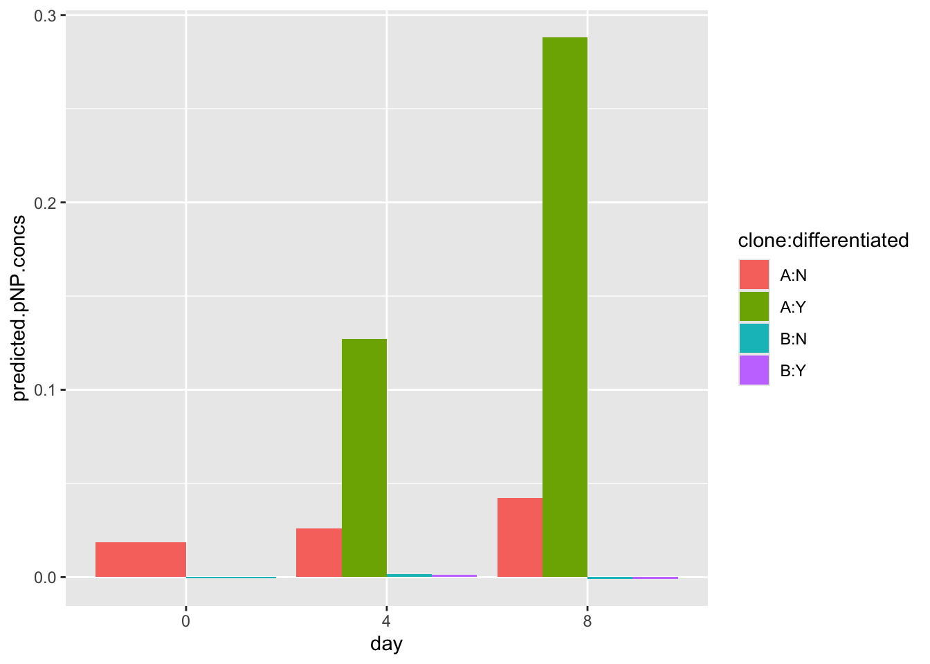
Note that this dummy data may look very different from your real data. You should compare your data to the model data shared with you on the VLE by plotting both sets of data. If your data doesn’t follow the same trend, you are advised to use the model data
Now let’s make a plot (with the normalised data). This will account for differential growth rates of the clones.
# first check that data columns we have
names(pnp.experimental.data)
[1] "day" "clone" "differentiated"
[4] "absorb.rep1" "absorb.rep2" "absorb.rep3"
[7] "DNA_ug_per_ml" "absorbance" "predicted.pnp.conc"
[10] "normalised.pnp.conc"#make the plot using the normalised.pnp.conc as y values
ggplot(data=pnp.experimental.data, aes(x=day, y=normalised.pnp.conc,fill=clone:differentiated)) +
geom_bar(stat="identity", position=position_dodge())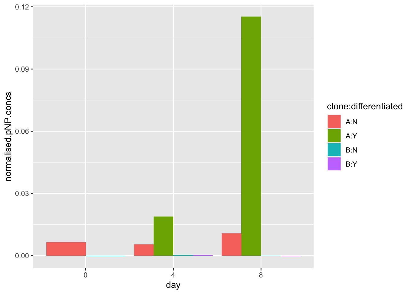
#make the plot using the normalised.pnp.conc as y values
ggplot(data=pnp.experimental.data, aes(x=day, y=normalised.pnp.conc,fill=clone:differentiated)) +
geom_bar(stat="identity", position=position_dodge())+
xlab("day")+
ylab("normalised pNP concentration")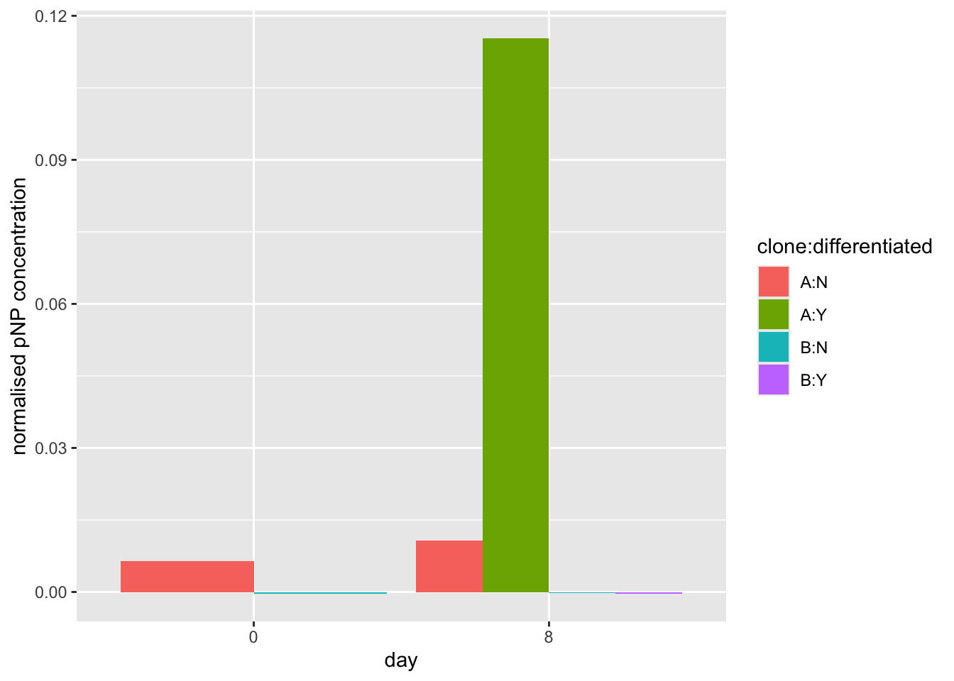
Finally, we will save our pnp.experimental.data, with our predicted.pnp.conc and normalised.pnp.conc values. We may use this if we conduct an ANOVA (see below).
#output the pnp.experimental.data to a tab-separated file (TSV)
write_tsv(pnp.experimental.data, file = "pnp_experimental_data_normalised.tsv")
4.4 End of Part 1.
5 Exercises (Part 2): Exploring MCS movement
5.1 Loading data
First, load the data from the website, and check what you have:
#load data from a URL
points <- read_csv(url("https://djeffares.github.io/BIO66I/data/processed-points-data.csv"),
                 col_types = cols(LID = col_factor(),TID = col_factor(),pid = col_factor())
)

#check what we have
glimpse(points)
Rows: 14,956
Columns: 15
$ LID <fct> 1, 1, 1, 1, 1, 1, 1, 1, 1, 1, 1, 1, 1, 1, 1, 1, 1, …
$ TID <fct> 1, 1, 1, 1, 1, 1, 1, 1, 1, 1, 1, 2, 2, 2, 2, 2, 2, …
$ pid <fct> 1, 2, 3, 4, 5, 6, 7, 8, 9, 10, 11, 1, 2, 3, 4, 5, 6…
$ x.position <dbl> 743.701, 745.041, 745.041, 735.661, 737.001, 737.00…
$ y.position <dbl> 684.741, 686.081, 686.081, 692.781, 686.081, 678.04…
$ time <dbl> 0, 23, 46, 69, 92, 115, 138, 161, 184, 207, 230, 25…
$ track.length <dbl> 0.000, 1.895, 1.895, 13.422, 20.255, 28.295, 42.091…
$ euclidean.distance <dbl> 0.000, 1.895, 1.895, 11.370, 6.833, 9.475, 18.760, …
$ jump.distance <dbl> NA, 1.895, 0.000, 11.527, 6.833, 8.040, 13.796, 14.…
$ velocity <dbl> NA, 0.082, 0.000, 0.501, 0.297, 0.350, 0.600, 0.651…
$ clone <chr> "A", "A", "A", "A", "A", "A", "A", "A", "A", "A", "…
$ starting.x <dbl> 743.701, 743.701, 743.701, 743.701, 743.701, 743.70…
$ starting.y <dbl> 684.741, 684.741, 684.741, 684.741, 684.741, 684.74…
$ normalised.x <dbl> 0.000, 1.340, 1.340, -8.040, -6.700, -6.700, 0.000,…
$ normalised.y <dbl> 0.000, 1.340, 1.340, 8.040, 1.340, -6.700, -18.760,…head(points)# A tibble: 6 × 15
LID TID pid x.position y.position time track.length euclidean.distance
<fct> <fct> <fct> <dbl> <dbl> <dbl> <dbl> <dbl>
1 1 1 1 744. 685. 0 0 0
2 1 1 2 745. 686. 23 1.90 1.90
3 1 1 3 745. 686. 46 1.90 1.90
4 1 1 4 736. 693. 69 13.4 11.4
5 1 1 5 737. 686. 92 20.3 6.83
6 1 1 6 737. 678. 115 28.3 9.48
# ℹ 7 more variables: jump.distance <dbl>, velocity <dbl>, clone <chr>,
# starting.x <dbl>, starting.y <dbl>, normalised.x <dbl>, normalised.y <dbl>5.2 What is in the ‘point’ data?
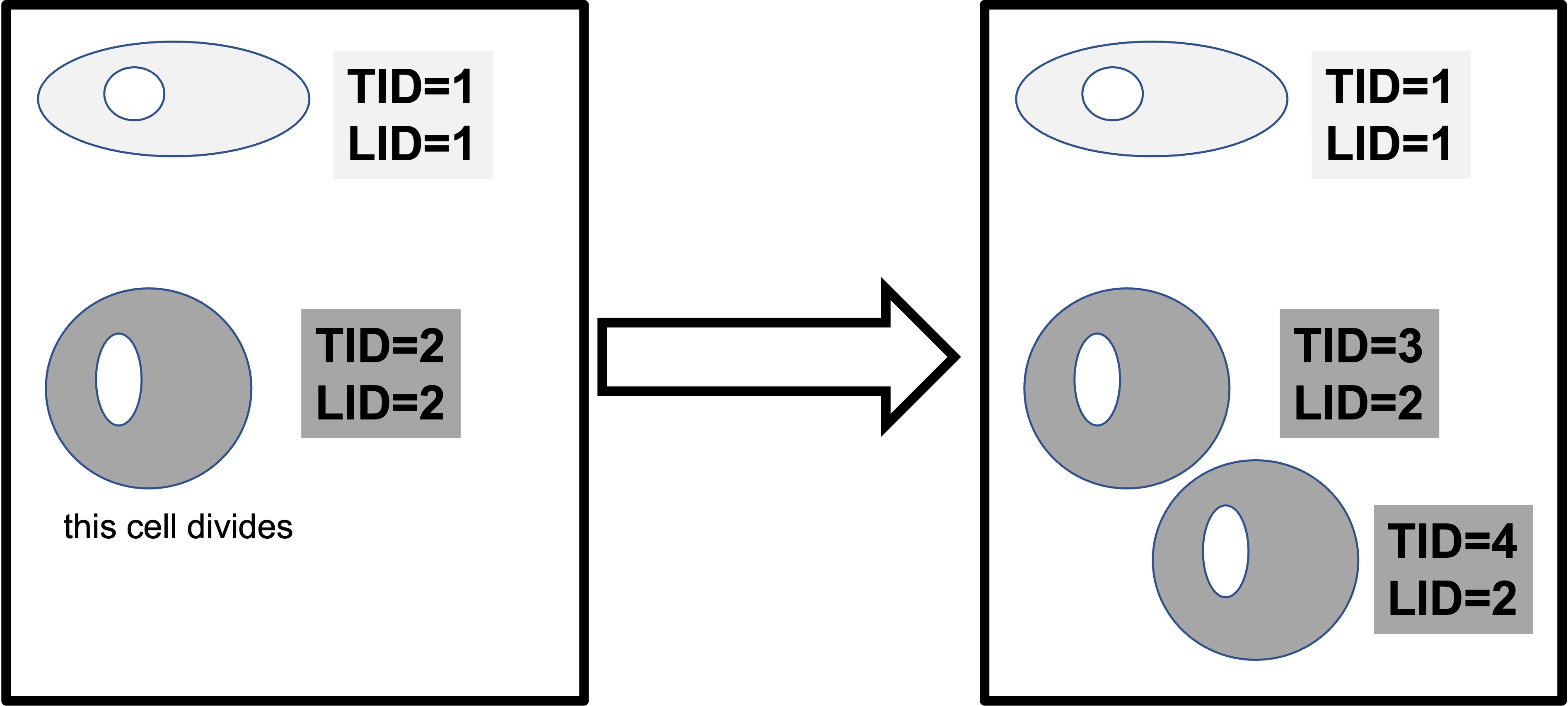
This data contains the positions of cells, tracked over time. Lineages are tracked. We have data for tracked cells for both clones (A and B). We have the following information, for many time points:
- lineage ID (LID)
- tracking ID (TID)
- data point id* (pid)
- the location of the cell in x and y coordinates (x.position, y.position)
- the time point (time)
- movement metrics (track.length, euclidean.distance, velocity)
- a new movement metric: how far the cell moved between this time point, and the last one (jump.distance)
- clone (A/B)
- the start starting.x starting.y for each cell (the first time point for each cell, which is the same for all time points for that cell)
- the normalised.x normalised.y (which is the position at each time point, relative to the starting position)
NB: pid describes what data point the row of data corresponds to for a cell with a specific LID and TID. For example, LID 1 TID 1 PID 1 would correspond to the first data point (its x and Y coordinates etc) for a cell with TID 1 from lineage 1.
5.3 Exploratory plots
5.3.1 Recap: how fast do they move
You’ll notice that this file has velocity, just like the last file we used in workshop 3. For a simple ‘sanity check’, we will test again that the clones differ.
Caution
We know that clone A moves faster than clone B. So why do it again?
Answer: data hygiene. We want to be very sure our data is good.
points |>
  ggplot(aes(x=clone,y=log10(velocity)))+
  geom_violin()+
  stat_compare_means()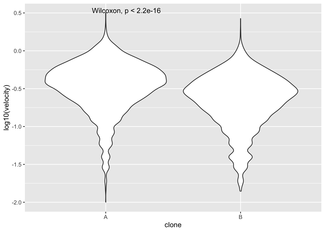
What does this do?
To find out what any function does, type ?function in the RStudio Console. For example to find out what glimpse does:
?glimpseHelp on topic 'glimpse' was found in the following packages:
Package Library
tibble /Library/Frameworks/R.framework/Versions/4.5-arm64/Resources/library
pillar /Library/Frameworks/R.framework/Versions/4.5-arm64/Resources/library
dplyr /Library/Frameworks/R.framework/Versions/4.5-arm64/Resources/library
Using the first match ...5.3.2 Plotting cell movement tracks
Now, let’s examine the directions the cells move in. A simple way to do this is to plot the x and y coordinates. We will use facet_wrap to plot one box for each lineage ID LID. Remember, a lineage ID contains information for each cell, and all its daughter cells and so on.
To keep our image simple, we allow clone A and clone B to be on the same panels. But note that clone A, lineage ID 1 has no relationship to clone A, lineage ID 2 - they are merely the first lineage ID that Amanda tracked.
points |>
  ggplot(aes(x=normalised.x,y=normalised.y,colour=clone))+
  geom_point(size=1,alpha=0.2)+
  facet_wrap(~LID)+
  geom_hline(yintercept = 0,colour = "grey",linetype = "dashed")+
  geom_vline(xintercept = 0,colour = "grey",linetype = "dashed")+
  theme_classic2()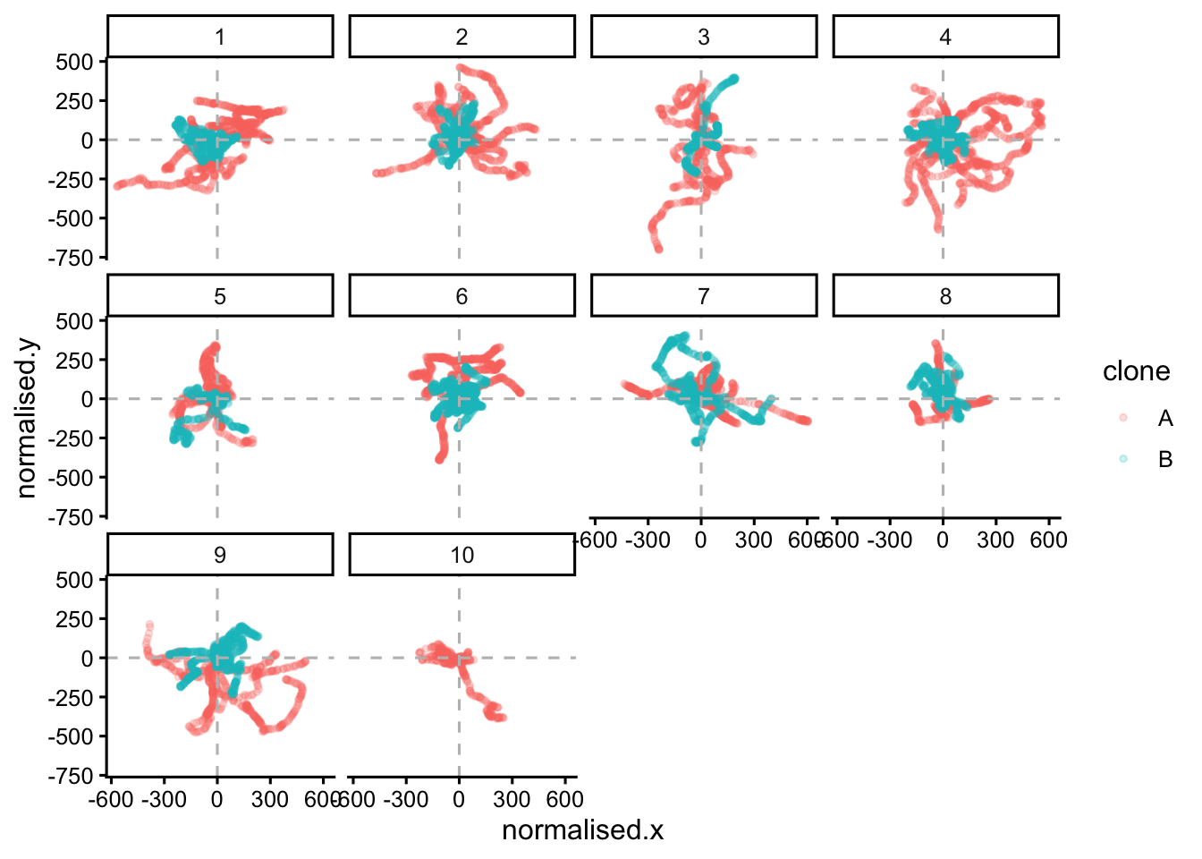
#If we want to show just one clone add this line after 'points |>'
#filter(clone == "A")|>
We can see that they wriggle about a lot. They do not move in straight lines. To show one lineage, from one clone and colour by TID (or time), we can do:
# plot the paths taken by the cells in lineage 4 of clone A
#colouring by tracking ID (TID)
points |>
  filter(clone == "A" & LID==4) |>
  # Convert TID to factor with numeric ordering
  mutate(TID = factor(TID, levels = sort(as.numeric(as.character(unique(TID)))))) |>
  ggplot(aes(x=normalised.x,y=normalised.y,colour=time))+
  geom_point(size=1)+
  facet_wrap(~TID)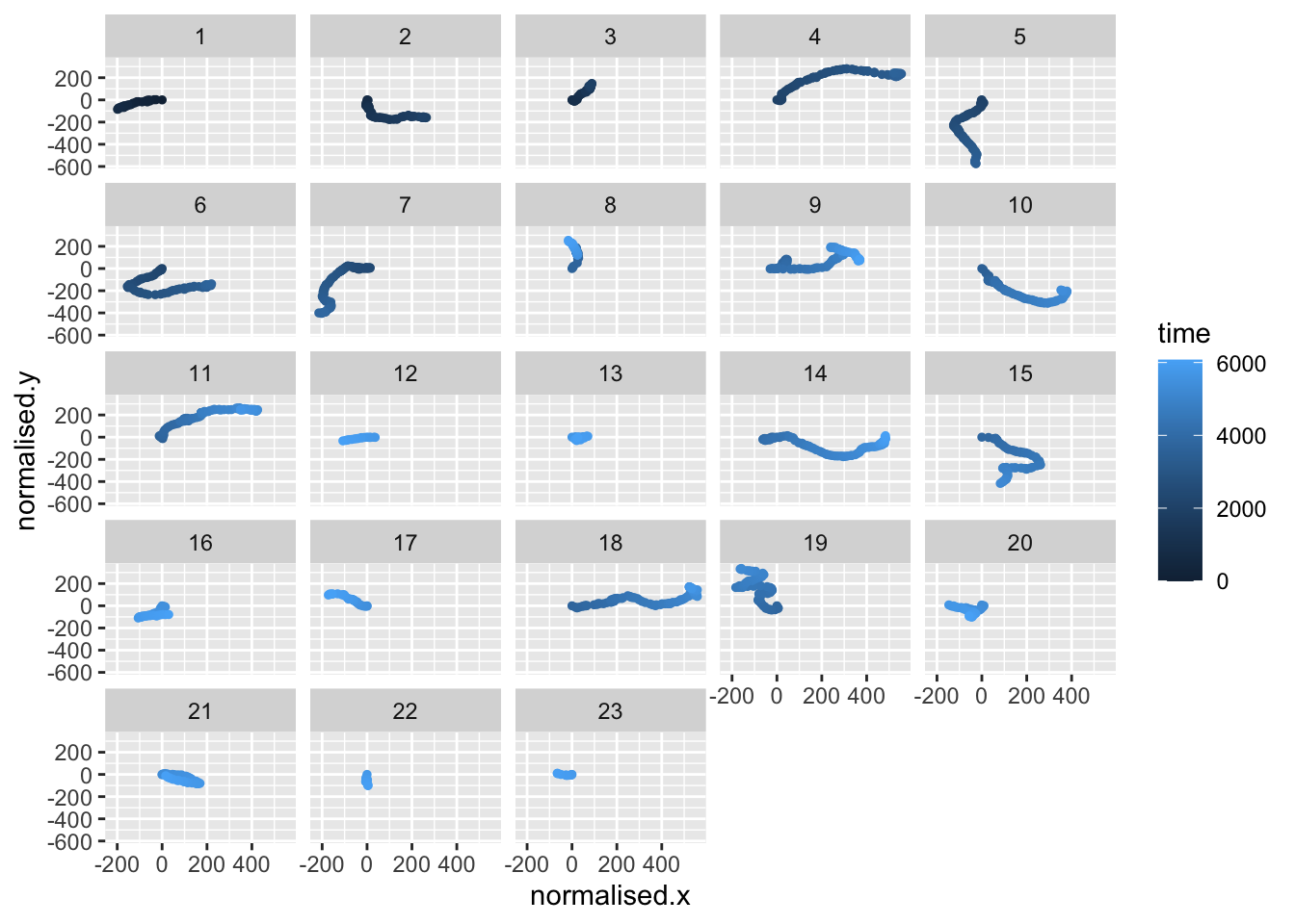
This time we use colour=time to indicate the time point of each data point. You can see that the cells from one lineage move in different directions. You can investigate other lineages and clones by changing the filter line, for example: filter(clone == "B" & LID==2) |>
5.4 Animate it!
ggplot2 can achieve almost any plot you can imagine (and probably some you can’t imagine!). Creating very visually appealing graphics can help enormously to explain complex data. Animated plots are much more intuitive for explaining data with a time element.
Here is how to make an animated plot with gganimate:
5.4.1 Animate: step 1.
Make a static plot:
# make the static plot
static.plot <- points |>
  filter(clone == "B", LID == 1) |>
  ggplot(aes(x=normalised.x, y=normalised.y, colour=as.numeric(TID)))+
  geom_point(size=1, pch=1, lwd=2)+
  geom_hline(yintercept = 0, colour = "grey", linetype = "dashed")+
  geom_vline(xintercept = 0, colour = "grey", linetype = "dashed")+
  theme_classic2()+
  labs(colour = "Tracking ID")
# view the static plot
static.plot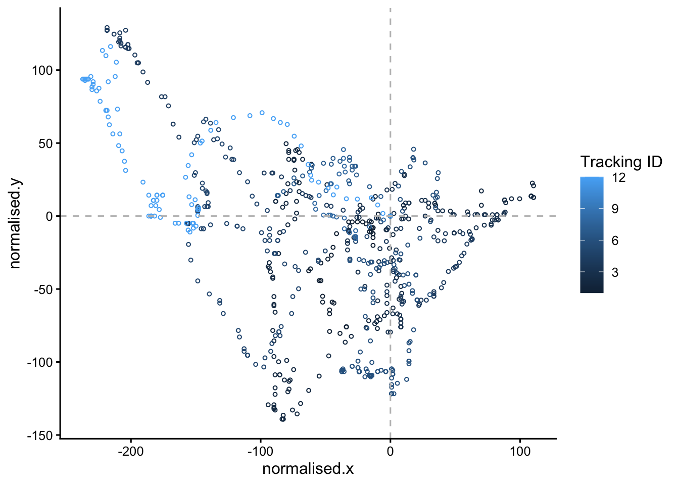
Here we only look at one clone and one lineage ID in the line
filter(clone == "B", LID == 1) |>
You can (and should) alter the code to look at other clone and lineage IDs. You might also like to try these alternatives:
colour=timefacet_wrap(~LID)geom_point(size=5, pch=1)
5.4.2 Animate: step 2
Animate the plot:
#set up the animation
animated.plot <- static.plot +
  transition_time(time) +
  shadow_mark(past = T, future=F, alpha=0.5)
animated.plot
5.4.3 Animate: step 3
We then render the animation
#render the animation, saving it in an object called 'rendered.animation'
rendered.animation <- animate(
  animated.plot,
  width = 600,
  height = 600,
  renderer = gifski_renderer()
)
rendered.animation
Save the animation as a GIF
#save the animation as a gif
#make sure you use a sensible file name
anim_save("cloneB.lineage2.gif", rendered.animation)
See this website to learn more about gganimate.
That is all for this workshop today. If you have time do look at the revision summary below.
6 Revision
This section will summarise what we have learned in the BABS core workshop and cell biology workshops; workshop 2, workshop 3 and workshop 4 (this one).
If you don’t recall, or are unsure about, any of these topics - look at them again. Two principles of data science are worth recalling now:
1. Technical skills are important
To be a skilled data analyst, you need to master some technical skills. This is worth putting time and effort into, because there is a demand for skilled data analysts, both within and outside of science. This website is an example.
In this module you have learned these technical skills:
- loading libraries and installing packages
- importing data
- filtering rows to obtain subset of the data (using
filter) - selecting columns to keep data simple (using
select) - creating plots
2. Data-handling principles are also important
These are:
- keep files and scripts organised
- name variables carefully
- comment your code
- make your analysis clear and reproducible
We will now summarise and review what we have learned in each workshop.
6.1 Data Analysis 1: Core
In this workshop, we learned:
- How to achieve reproducibility
- Setting up an RStudio Project
- Loading packages
- The importance of looking at, and knowing, your data
- Creating plots with
ggplotto help with knowing your data - Quality control
It is the understanding that matters
Understanding takes time. Be sure you understand all these concepts well.
6.2 Workshop 2: Cell Biology
In this workshop, we learned about:
- Loading data from websites with
read_tsvandread_csv. - Exploring data with
view,names,ncol,ncol,nrow,summary, andglimpse - Summarising large data sets with
dplyr - Making plots to compare two or more categories with
geom_boxplot,geom_violin, andgeom_jitter - The differences between P-values and plotting small vs large data
What does this do?
To find out what any function does, type ?function in the RStudio Console. For example to find out what glimpse does:
?glimpse6.3 Workshop 3: Cell Biology
In this workshop, we learned about:
- Using
summaryto describe a large data frame - Adjusting plot with a log scale (often important for biological data)
- Using
facet_wrapto create multiple panels for different replicate and so on - ‘Reshaping’ data tables with
pivot_longer - Correlations between metrics in data sets (this is very common in biological data)
- Creating a correlation heat map
6.4 Workshop 4: Cell Biology (this workshop)
We learned:
- How to make and use a linear model to infer values from a standard curve
- How to plot objects on two-dimensional planes
- How to use
facet_wrap(again) - How to animate plots!
7 Reflection
Ask yourself, and discuss with your classmates:
- What is your favourite way to quickly get to know a data set?
- Why do we make plots?
- Is a statistical test always reliable? What if our data set is very small? (or very large?)
- What is the value of both laboratory work and data analysis?
- Would you prefer to do laboratory work, data analysis, or both?
7.1 Consolidation exercises
To consolidate, follow up on aspects of the previous workshops that you are unsure about. Try some different plots. Break the code, then try and fix it.
7.2 Planning for your report
The RStudio Project should:
Create a logical folder structure for your analysis. The top folder should be named with your exam number, for example Y12345678, do not include your name in the submission. Your submission should include the script you used for your work, any accessory functions and the data itself. Your script should be well-commented, well-organised and follow good practice in use of spacing, indentation and variable naming. It should include all the code required to reproduce data import and formatting as well as the summary information, analyses and figures in your report.
8 Supplementary analysis: three-way ANOVA
In Practical 3, you collected absorbance readings for concentrations of pNP in triplicate, to provide an indication of the two clones to undergo osteogenesis. pNP concentrations were measured in day 0,4 and 8, and at each time point you have data for both induced cells and non-induced cells (negative control), with the exception of day 0 as the differentiation was induced at day 1.
To find out which conditions affect pNP, we can carry out a three-way ANOVA to compare the effects of three grouping variables (day, clone and induction condition) on one response variable (pNP concentration).
The methods below show you how to do this. We first start by assuming that the grouping variables do not interact (ie: combinations of two factors don’t cause different outcomes to each factor alone), in what is called an additive model.
But the three grouping variables may have interacting effects, and not be independent. So we then examine a non-additive (or multiplicative) model. You’ll see more clearly what this means as you do the analysis.
An example of a multiplicative model
Two people (A and B) walk back to their hotel, in a city they don’t know well. Last time, when they both had their phones, it took 30 minutes. When person A lost their phone, it took 35 minutes (ie: +5 minutes). When both A and B lost their phones, it took 60 minutes. This is much longer than we would expect if the lost-phones problem was simply an additive effect of two phones being lost (30 + 5 + 5). The problems were multiplicative rather than merely additive.
8.1 Read data and reformat with pivot_longer
We’ll assume you have the tidyverse and readxl libraries loaded already. If not, load these now.
First, we load the data. Your data file might have a different name. This code will work without adjustment if your file has the same rows and columns as this example file. We’ll also rename a column, so it’s more intuitive.
# first, we load our normalised experimental data again
# with our predicted values, normalised for DNA content
pnp.experimental.data.normalised <- read_tsv("pnp_experimental_data_normalised.tsv")

#rename the 'differentiated' column 'induced', which describes it better
names(pnp.experimental.data.normalised)[3]<-'induced'
Then we need to set some columns to be factors:
#set day, clone and induced columns to be factors
pnp.experimental.data.normalised$day <-as.factor(pnp.experimental.data.normalised$day)
pnp.experimental.data.normalised$clone <-as.factor(pnp.experimental.data.normalised$clone)
pnp.experimental.data.normalised$induced <-as.factor(pnp.experimental.data.normalised$induced)

#this is what we have:
head(pnp.experimental.data.normalised)
Now we use pivot_longer to reformat the data, so we can use all the repeats. The cols=!c(day,clone,induced) part indicates that the day, clone and induced columns are not to be lengthened into the absorbance column. So it is absorptionrep1,absorptionrep2 and absorptionrep3 that are put into the absorbance column.
# pivot the table to a longer format
# where everything is a category, except the normalised.pnp.conc
# which we added earlier with: mutate(normalised.pnp.conc = predicted.pnp.conc / DNA_ug_per_ml)
pnp.experimental.data.normalised.long <- pnp.experimental.data.normalised |>
  pivot_longer(cols=!c(day,clone,induced), names_to = "replicate", values_to = "normalised.pnp.conc")

#this is what we have now
head(pnp.experimental.data.normalised.long)
8.2 Make some plots
If we look at the absorbance by day, we can see that absorbance goes up each day. Here we are ignoring the media (induced).
# make a plot of the absorbance for each clone
# we make geom_boxplot, and then layer a geom_point on top
ggplot(pnp.experimental.data.normalised.long, aes(x = clone, y = normalised.pnp.conc, colour = day))+
  geom_boxplot(outliers = FALSE, position = position_dodge(width = 0.8))+
  theme_classic()+
  geom_point(position = position_jitterdodge(jitter.width = 0.2, dodge.width = 0.8),
             alpha = 0.7, size = 5)
Then we can use facet_wrap to examine the data by day and by media. We can see that clone A has much higher values in the differentiation media.
# make a plot of the absorbance for each clone
# using facet_wrap to differentiate the induced from non-induced data
# we make geom_boxplot, and then layer a geom_point on top, as before
ggplot(pnp.experimental.data.normalised.long, aes(x = clone, y = normalised.pnp.conc, colour = day))+
  geom_boxplot(outliers = FALSE, position = position_dodge(width = 0.8))+
  theme_classic()+
  geom_point(position = position_jitterdodge(jitter.width = 0.2, dodge.width = 0.8),
             alpha = 0.7, size = 5) +
  facet_wrap(~induced)
8.3 ANOVA (additive model)
To find out if there is evidence that the absorbance value is affected by day, clone or media using an ANOVA, we can use the R function aov().
#we save the result in an object called aov.result.additive
aov.result.additive <- aov(normalised.pnp.conc ~ day + clone + induced, data = pnp.experimental.data.normalised.long)
To view the results, we do:
summary(aov.result.additive)
Interpretation
When p-values are < 0.05, this means we have a significant effect from this factor. Do day, clone, and the induction media all have a significant effect?
8.4 ANOVA (multiplicative model)
Now examine a multiplicative (non additive) model. Here we examine whether interactions between the factors affect the pNP levels. To test this, we simply replace the plus symbol (+) with an asterisk (*) in our code:
#run the ANOVA
aov.result.interaction  <- aov(normalised.pnp.conc ~ day * clone * induced, data = pnp.experimental.data.normalised.long)

#to view the results
summary(aov.result.interaction)
Interpretation: The multiplicative model includes all single factors, all pairwise factors (eg: day:clone) and the interaction of all three factors (day:clone:induced). Where the p-values Pr(>F) are < 0.05, we have a significant effect of this factor (or factors) on the pNP level (and therefore osteogenesis).
9 The End
Download Code
You can download all the R code from this workshop as a single script file: workshop4.R