BIO00056I
Workshop 6: Population Genomics
The assessment for this module is a 2000 word report. The deadline for this report has been moved by the Department of Biology, from Monday 19th January to Tuesday 20th Jan 12:00 noon. See the report guide for more details.
1 Learning objectives
The aims of this workshop are to:
- Learn more about population genomics data
- View a real-world example of population structure analysis
- Appreciate how population genomics can be applied to eco-epidemiology (the study of the ecology of infectious diseases)
2 Introduction
2.1 Evolution, populations and genome data
You will be aware now from earlier on in this module that:
– Sometimes hybrids occur between these closely related species.
- Most species contain multiple populations. Genetically, a population is a group of individuals more closely related to each other than to other groups, reflecting shared ancestry.
In practice, it can be hard to tell which population—or even which species—an individual belongs to, especially for micro-organisms. In this workshop, we’ll use genome data to investigate these questions.
In Figure 1 below, each box represents a population that contains many individuals. Red and blue boxes represent two species. Some regions have hybrids (mixed colours), and some do not. Some populations show a little mixing; others show a lot.
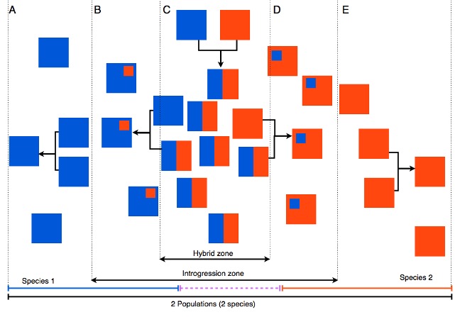 Figure 1: Imagined populations of two species (red and blue), with some hybrids and varying levels of mixing.
2.2 The topic for today
In this workshop, we’ll look at new genome data from Leishmania parasites collected in the Amazon. Leishmania are single-celled protozoan parasites that infect mammals, including people. They have two copies of each chromosome (diploid) and reproduce sexually (they undergo meiosis).
We’ll focus on Leishmania guyanensis and closely related species found in South America. Together they form a species complex called Viannia—closely related species that can sometimes interbreed where their ranges overlap.
These parasites cause cutaneous leishmaniasis (CL), a skin disease that leads to long-lasting sores. CL is zoonotic, meaning it mostly circulates in wild animals; humans are infected but probably play a small role in maintaining the parasite population.
Because Viannia parasites infect many native mammals in South America, they are probably deeply embedded in the region’s ecology.
2.2.1 Leishmania are spread by sand flies
Three facts about sand flies are important for today:
- Sand flies are mainly found in forests or forest edges (not in sand on the beach).
- They are not strong flyers, so they don’t carry Leishmania parasites very long distances.
- The different sand fly species, and even populations within species, have their own ecological niches and characteristics.
- For example, certain populations of sand flies carry some species of Leishmania, but not others.
2.3 The data we will use in this workshop
We’re studying the genetics of the Viannia group of Leishmania parasites. The analysis is being carried out at the University of York, working with colleagues in Manaus, Brazil—a large city on the Amazon River surrounded by the Amazon Rainforest. Because the Amazon is so biodiverse, several Viannia species may be present there.
Parasites were isolated from patients with cutaneous leishmaniasis (CL) and grown in the lab to extract DNA. We then sequenced the DNA from 70+ parasites using short-read (Illumina) sequencing.
From these genomes, we identified single-nucleotide polymorphisms (SNPs)—tiny differences at single DNA letters. To add context, we also included public data for related Viannia species from the European Nucleotide Archive. A short summary of the computational steps is at the end of this document.
For this workshop, all you need to know is that we have SNP data from:
- 71 Leishmania strains collected in Manaus (most likely to be L. guyanensis)
- 21 L. braziliensis strains from various locations in Brazil
- 25 L. panamensis strains from Panama
- 34 L. peruviana strains from Peru
- one L. shawi strain from Brazil
We’ll use these data to explore species, populations, and mixing (hybridization) within the Viannia group.
3 Exercises
3.1 Exploring the data
In this workshop we will explore the results we generated. We will look at three ways to visualise population structure.
3.1.1 Population genomic data files
While genomes contain many types of polymorphisms, population genomic analysis often uses only single nucleotide polymorphism (SNP) data. This is because SNPs are very abundant and have properties that make them easier to model mathematically.
SNPs and other polymorphisms are affected by many processes, such as genetic drift, migration, selection and recombination. However, SNP data can be represented relatively simply as a table.
The standard format for representing SNP data is called VCF (Variant Call Format). Here is a small example of what a VCF file looks like.
#CHROM  POS REF ALT Lg1 Lg2 Lg3 Lg4
01  2177    A   G   0/1 1/1 1/1 0/1
01  2636    G   A   0/0 0/1 0/1 0/0
01  9844    G   A   0/1 0/0 0/0 0/0
...
35  9999    G   A   1/1 0/0 0/1 0/0
It is almost like a table that we could load into Excel, where each row indicates a position in the genome, and columns contain information about that position.
It has a header line:
#CHROM POS REF ALTThis indicates that the first column is the chromosome number (#CHROM), the second column is the position on that chromosome (POS), the third column is the reference allele (REF), and the fourth column is the alternative allele (ALT).
After this, we have the genotypes for each sample. In this example, there are four samples:
Lg1 Lg2 Lg3 Lg4After this, we have the genotypes for the strains that are in the VCF (four in this case). They are coded as 0 for the reference allele (A) and 1 for the alternative allele (G). So for an A/G polymorphism:
- AA is coded as
0/0 - AG is coded as
0/1 - GG is coded as
1/1
The population genomics community has developed many software tools that process these data to extract information (no tool does it all). In this workshop we will look at a phylogenetic tree, principal components analysis (PCA), and a STRUCTURE plot. These are all used to describe population structure and detect hybrids between populations or between species.
3.2 The phylogeny
A phylogenetic tree is a good first look at how similar or different many samples are. But when individuals mix between populations or species (hybridisation), a simple branching tree can be misleading.
Think of a tree of people grouped by ancestry. Where would you place someone with one parent from Spain and one from Fiji? They don’t fit neatly on a single branch with the Spanish and the Fijians. The same display issue can happen in nature when populations interbreed.
To handle this, we used a network approach (a splits network made with the software SplitsTree) that can show conflicting signals in the data—like those caused by mixing between populations or species.
Below is our SplitsTree network. There are many samples, so coloured dots cluster tightly. The Manaus samples are dark blue. Most cluster near Leishmania guyanensis at the top. We marked the Manaus samples that do not with arrows.
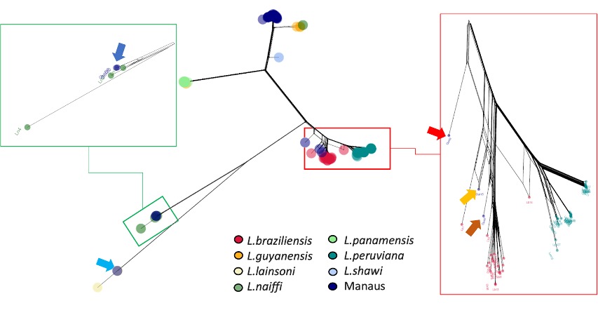 Figure 2: A SplitsTree phylogeny. The overall phylogeny is in the centre, and we zoom in to various clades (groups of related samples) around the edges. Each dot is a sample, coloured by species. The dark blue dots are samples we collected from Manaus, Brazil.
3.2.1 Interpreting the phylogeny
Now spend some time discussing the SplitsTree phylogeny, using the discussion points below as a guide.
From this figure, do the Viannia species look clearly separated, or do some overlap?
Answer: Yes, the species are mostly separated, but there looks to be a hybrid in the inset on the right.
A few Manaus samples don’t cluster with L. guyanensis. What could explain that?
Answer: Some of the Manaus samples are different species. So there must be several species in this location.
- What might this suggest about the causes of CL in the Amazon (e.g., multiple species, local ecology, host/vector differences)?
- Answer: There are multiple species. They might interbreed in this location, but we cannot see this in the current phylogeny. We cannot tell anything about local ecology, host/vector differences from this phylogeny.
- Look at the L. peruviana–L. braziliensis area (red box). One strain sits between the two. What could that indicate?
- Answer: This is probably a hybrid.
- Examine the data from the single L. shawi sample (light blue). Does its branch look unusually short? Remember: branch lengths indicate the genetic distance between strains or species.
- Answer: Yes, it does look short. This is suspicious, but it is difficult to diagnose from this representation of the data. This shows a limitation of phylogeny.
3.3 Principal components clustering
Population structure is an important facet of most (if not all) species. Populations sometimes split into species, and all natural selection begins within a population. So when we start to examine the genetic diversity of a species, it is wise to look at population structure.
Principal components analysis (PCA) is a useful tool for understanding population structure. PCA reduces the variables in our data set (thousands of SNPs in rows, and many individuals in columns), while preserving a lot of the information about population structure.
A simple way to interpret PCA data is to consider that the distance between two individuals on a two-dimensional PCA plot represents the genetic distance between those samples. So, if they are close on the plot, they are close genetically. If they are distant on the plot, they are distant genetically. We would expect individuals from within a population or species to fall close to each other on a PCA plot.
First look at Figure 3 below. This shows PCA clustering of all the other Viannia species, apart from the samples we collected from Manaus. Discuss with the people at your table:
- Do the species cluster genetically?
- Do L. peruviana and L. braziliensis really look like two different species?
Note: The blue dashed lines are a guide to the eye to help you see the clusters.
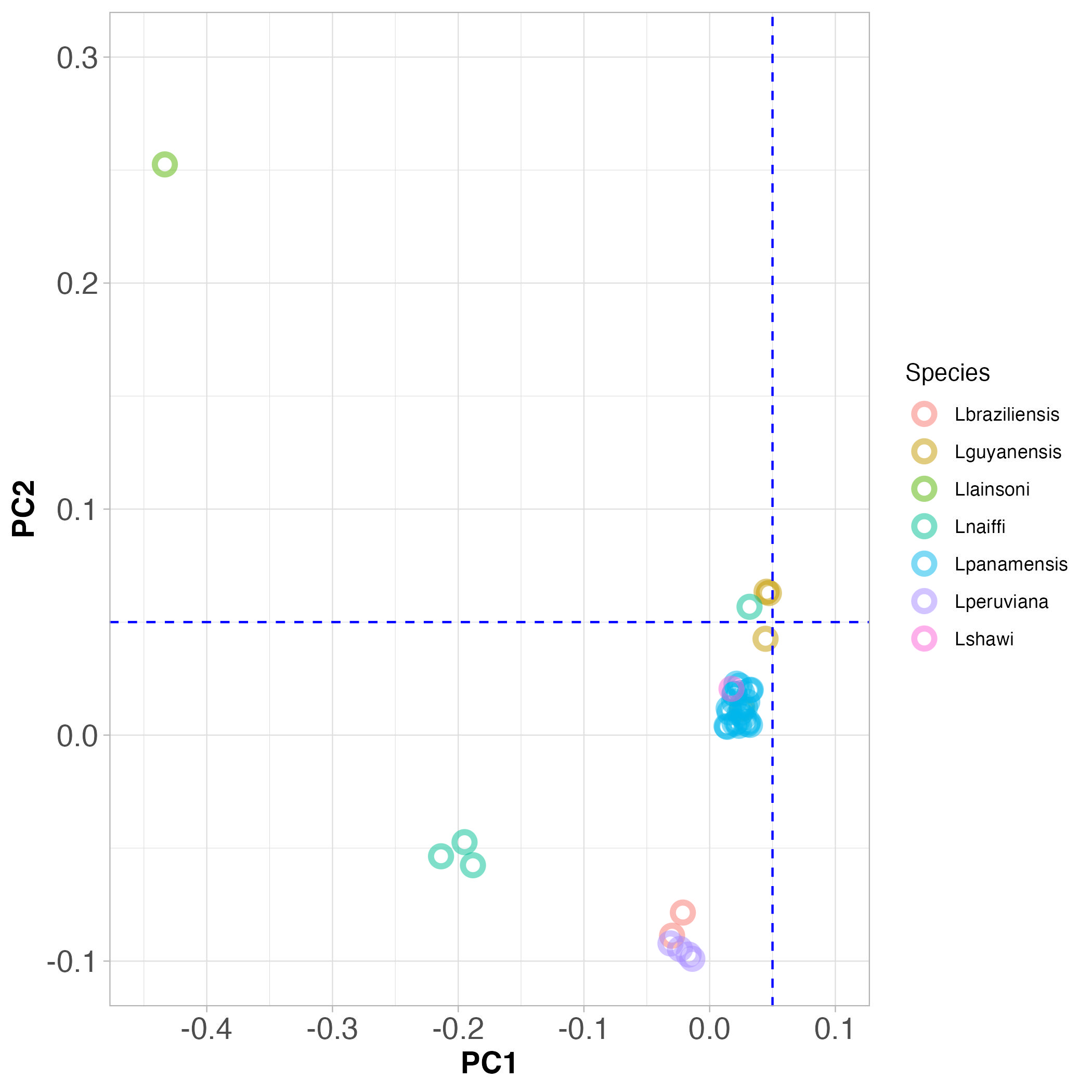 Figure 3. PCA clustering of Viannia species from throughout South America.
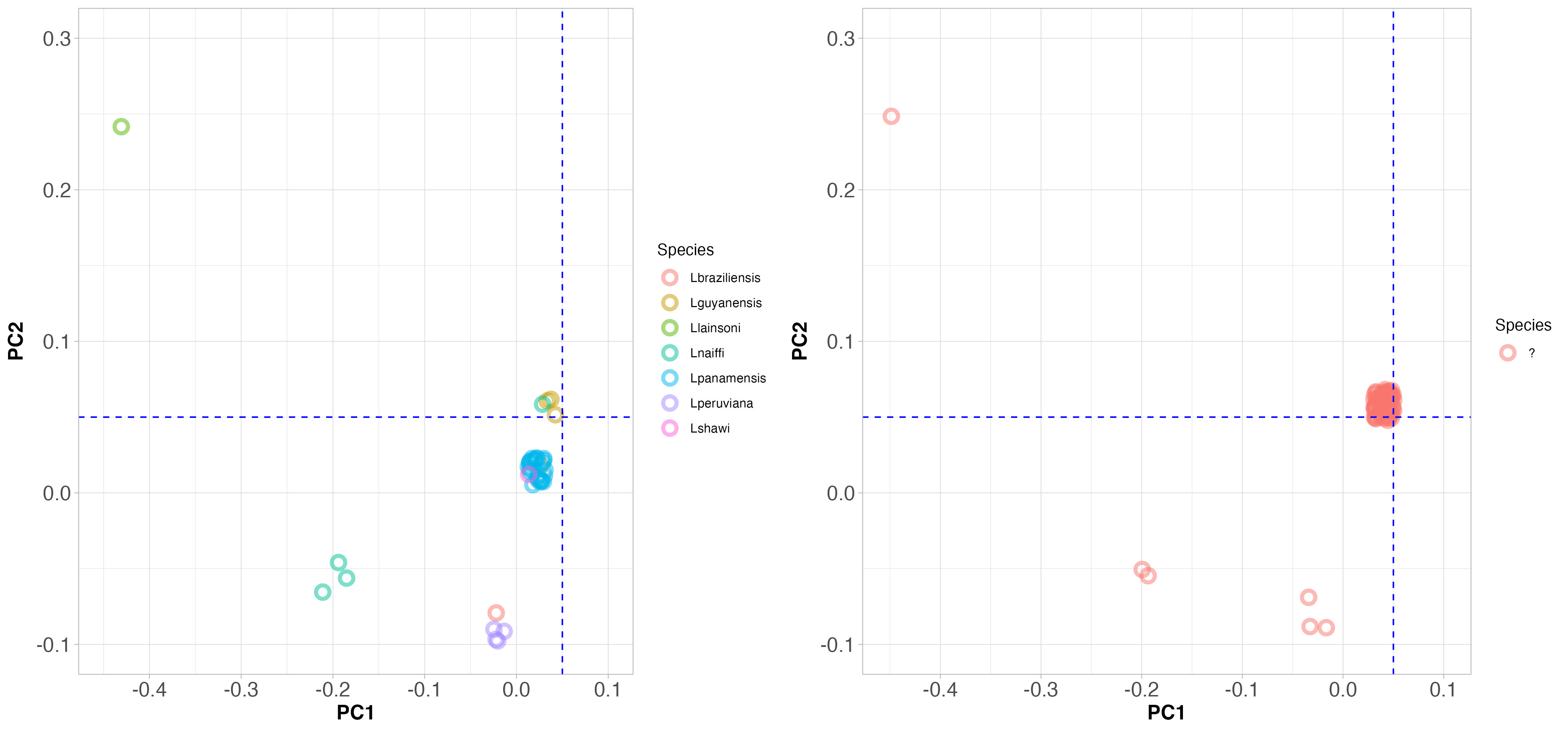
Now look at Figure 4, which shows PCA clustering of Viannia species from throughout South America (on the left), and those that were collected from Manaus (on the right). Note that the PC axes are on the same scale here.
3.3.1 Interpreting principal component plots
Use the discussion points below to discuss the PCA plots with the people at your table.
Does it look like the samples that came from Manaus are all the same species?
Answer: No certainly not. Some are in the same position as L. guyanensis, but others are from different species.
Since the positions on the PCA plot separate the species, does this help to identify the species from Manaus?
Answer: Yes, some are L. guyanensis, some are L. naiffi and others L. peruviana.
What does this tell you about the causes of cutaneous leishmaniasis in the Amazon region?
Answer: Since all these samples were collected from cutaneous leishmaniasis patients, this disease is caused by at least three different Leishmania species.
Since Leishmania are single-celled organisms and they all cause a similar disease, population genomics is the only way to identify which sample belongs to which species. Why would we not merely use PCR to identify the species?
Answer: Because we do see hybrids. If we used PCR, we might misidentify hybrids as one species or the other, depending on which gene we amplified. Population genomics allows us to see the whole genome, so we can identify hybrids.
3.3.2 Principal components clustering 2: geography and genetics
We can look at the PC plots another way, simply by colouring the samples according to where they came from (geography).
Because sand flies that carry Leishmania do not fly very far, it is possible that geographic distance is the main factor that determines the genetic distance between Leishmania populations. This concept is called isolation by distance.
The Leishmania parasites we have genome data for come from Brazil, Peru and Panama, which are very far apart, so we might expect to see isolation by distance in the PCA plot.
Note that in Figure 5 below: - the colour of each point indicates the location where the sample was collected - the position on the PCA plot indicates how closely related each sample is. If two strains sit close together on the plot, they are closely related genetically.
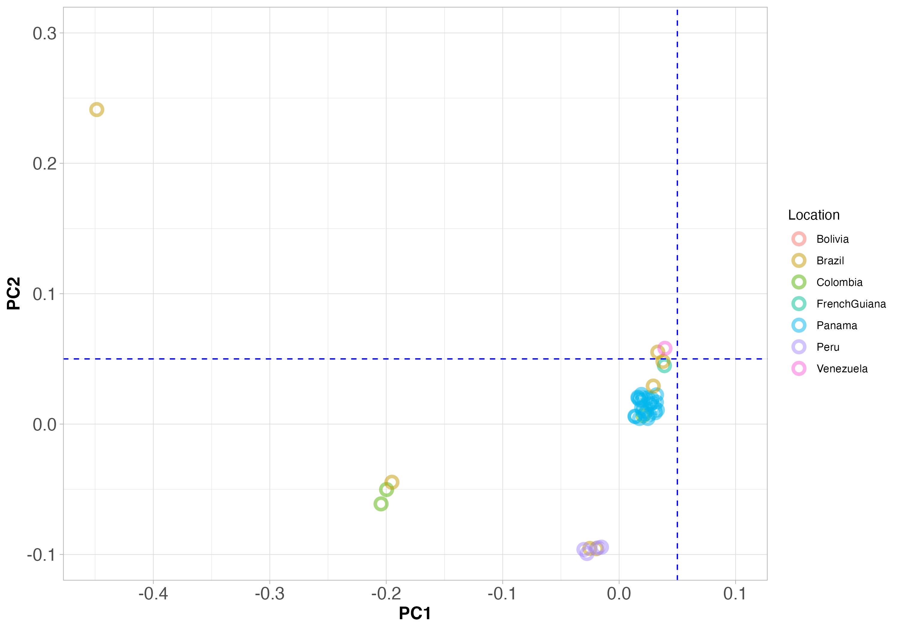
Figure 5. PCA clustering of Viannia species from throughout South America. The blue dashed lines are not important here, but will help with interpretation of Figure 6 below.
Note that samples from the same country are plotted in the same colour, and samples that are genetically similar will fall close together on the plot.
Do you see any examples of genetically similar samples that are all from the same country? These will represent one local population of the same species. This is what we expect from a local population that is one species.
Answer: Yes, Panama is the best example. We see many samples from Panama (blue) that are close together on the PCA plot, and so genetically related.
Do you see any examples of the opposite: genetically similar samples that are close together on the PCA plot, with different colours showing that they are from different countries?
Answer: Yes, there is a cluster of genetically-related strains where the blue dashed line cross each other, that are from different countries.
How can we interpret the finding that there are genetically similar individuals living in different countries? It might help to think about this with respect to human populations.
Answer: This suggests that there has been migration of Leishmania parasites between countries. This could be due to movement of infected people, or (less likely) the movement of infected animals that are reservoirs of the parasite.
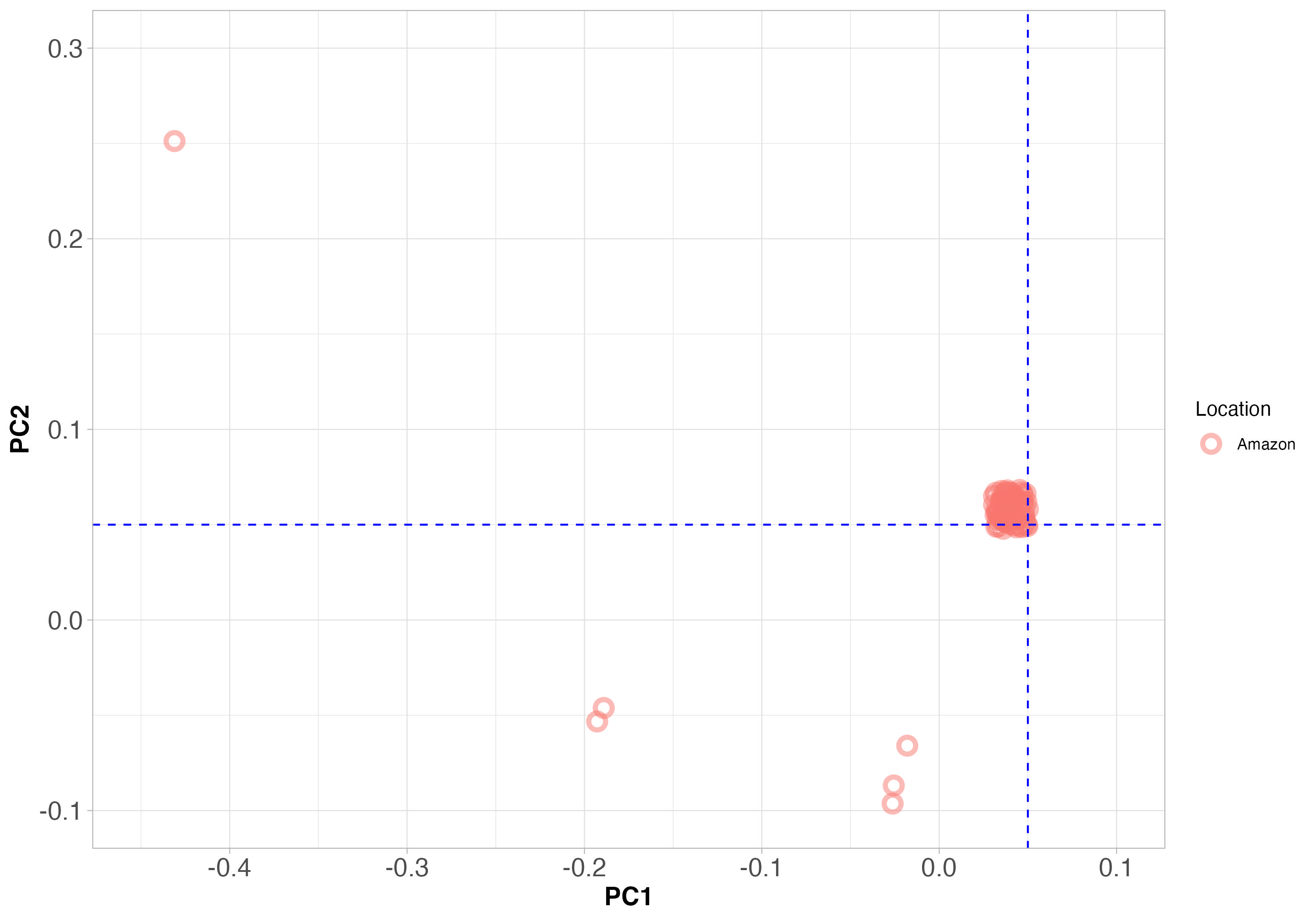
Figure 6. PCA clustering of only the Leishmania strains we collected from Manaus. The PCA axes are the same as Figure 5 above. The blue dashed lines will help with interpretation compared to Figure 5.
Since samples that are genetically similar will fall close together on the plot, does it look like all the samples from Manaus are the same species?
Answer: No, certainly not. This is consistent with what we observe in the phylogeny.
What does this tell us about the causes of genetic differentiation between species?
Answer: While species may have evolved in isolation, they now co-exist in Manaus. We do see hybrids on occasion, but generally the species remain distinct, even when they are in the same location.
In other words, why are all these Leishmania samples from Manaus not interbreeding and becoming more genetically similar?
Answer: There appears to be some kind of reproductive barrier between species, preventing them from interbreeding extensively. This could be due to the sand fly vectors, or some other ecological factor.
Can you guess what species are present in Manaus, based on the coordinates of species in previous PCA plots?
Answer: Yes, we can see that there are samples that look like L. guyanensis, L. naiffi and L. peruviana.
Is the idea that there are different Leishmania species in Manaus that we obtain from the PCA plots consistent with the phylogeny we looked at earlier?
Answer: Yes.
3.4 Admixture/STRUCTURE plots
A common way of showing population genomic data is with so-called STRUCTURE plots, generated using software called STRUCTURE, or a similar approach called ADMIXTURE, which is what we used. We’ll call these STRUCTURE plots for now.
STRUCTURE plots show the proportion of ancestry from different populations (or species) for each individual in the data set. Usually, each column of a STRUCTURE plot represents one individual, and the different colours within each column represent the proportion of ancestry from different populations (or species).
STRUCTURE plots are usually used to describe population structure within a species, but they can also be used to describe structure between closely related species, as we do here.
Our STRUCTURE plot is below. Samples from Manaus are marked in the open rectangle at the bottom of the plot. Again, most look like L. guyanensis, and those that do not are marked with arrows, as we did in the phylogeny.
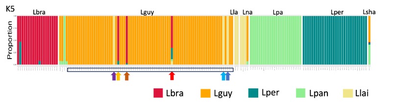
Figure 7. A STRUCTURE plot showing the Leishmania species we studied. Samples that were obtained from Manaus are marked in the open rectangle at the bottom of the plot. Most appear to be Leishmania guyanensis, but a few do not, and these are marked with arrows as we did in Figure 2, the SplitsTree phylogeny.
Each column is a different strain, and the colours represent the proportion of this strain’s ancestry that is derived from each species. If there are hybrids between species, we would expect to see columns with multiple colours.
The most obvious thing about this plot is that the species are different colours.
Does this visualisation of the data suggest that there is extensive breeding between species in the Viannia group?
Answer: No, most columns are a single colour, indicating that there is little interbreeding between species.
Consider the Leishmania parasites circulating around Manaus (see Figure 6). Do they all look like one species, or are there multiple species present?
Answer: No, there are multiple species present, consistent with what we saw in the phylogeny and PCA plots.
Look at the one strain of Leishmania shawi. This looks like a hybrid between two species.
Answer: Yes, it does look like a hybrid, with approximately half its ancestry is from L. guyanensis (orange) and half from L. panamensis (green).
Go back to Figure 2 (the phylogeny) and the PCA plots to examine where the Leishmania shawi sample is placed. Does its placement in those plots make sense, given what we see in the STRUCTURE plot?
Answer: Yes, in the phylogeny it sits between L. guyanensis and L. panamensis. This is not clear from the PCA plot.
4 Summary: what we have learned
Population genomics data can be used to explore population structure and hybridisation between populations and species.
There are different ways of visualising population genomics data, each with their own strengths and weaknesses.
In this workshop, we have seen examples of:
- isolation by distance (populations/species distributed across countries)
- multiple species in one location (Manaus), with rare hybrids between species
5 After the workshop: exam-style questions
5.1 Question 1. Populations and migration
A PCA plot of human populations from Europe is shown in Figure 8 below. Each point is an individual, and they are coloured by the country they come from. Small coloured labels represent individuals, and large coloured points represent median PC1 and PC2 values for each country.
- Is there evidence for extensive migration of individuals between countries in Europe? Explain your answer.
- What can we infer from these data about the alleles within countries that are close together on the PCA plot (e.g., Spain and Portugal) compared to countries that are far apart on the PCA plot (e.g., Finland and Italy)?
- What can we infer from these data about interbreeding between countries? Do between-country marriages look common, or the exception?
- Panel b of the plot shows the PCA coordinates of people from Switzerland, with individuals coloured by the language they speak (Germanic, French or Italian). Note that the location of these groups on the PCA plot corresponds to the location of their home countries on the PCA plot in panel a. Explain how this kind of analysis could be used to understand: (i) the migration of a parasite; (ii) how to conserve a threatened species.
- Panel c of the plot shows the correlation between genetic distance and geographic distance (km between individuals’ birthplaces). What phenomenon does this illustrate? How would you expect this to differ for a highly mobile species, such as birds, versus a less mobile species, such as fish in lakes?
5.1.1 Model answers
- Is there evidence for extensive migration of individuals between countries in Europe? Explain your answer.
Answer: If there were extensive migration between countries, we would expect to see individuals from different countries mixed together on the PCA plot. However, the PCA plot shows that individuals from the same country generally cluster together, to the exclusion of other countries. There are exceptions, however, such as Spain and Portugal that appear to be mixing.
- What can we infer from these data about the alleles within countries that are close together on the PCA plot (e.g., Spain and Portugal) compared to countries that are far apart on the PCA plot (e.g., Finland and Italy)?
Answer: We expect from the PCA plot that there are some alleles within countries that are shared between countries that are close together on the PCA plot (e.g., Spain and Portugal). In contrast, countries that are far apart on the PCA plot (e.g., Finland and Italy) are expected to share fewer alleles.
- What can we infer from these data about interbreeding between countries? Do between-country marriages look common, or the exception?
Answer: Between-country marriages appear to be the exception rather than the rule.
- Panel b of the plot shows the PCA coordinates of people from Switzerland, with individuals coloured by the language they speak (Germanic, French or Italian). Note that the location of these groups on the PCA plot corresponds to the location of their home countries on the PCA plot in panel a. Explain how this kind of analysis could be used to understand: (i) the migration of a parasite; (ii) how to conserve a threatened species.
- The migration of a parasite: the Switzerland PCA shows three barely-separated groups, indicating frequent mixing. If we saw such a signal for a parasite, it would suggest that the parasite is moving frequently between regions.
- To conserve a threatened species so that it is robust to threats such as diseases and environmental change, we would like to retain the genetic diversity of the species. If we saw a PCA plot with distinct clusters, this would suggest that there are distinct populations that should be conserved separately to retain genetic diversity, and we should aim to preserve all these populations.
- Panel c of the plot shows the correlation between genetic distance and geographic distance (km between individuals’ birthplaces). What phenomenon does this illustrate? How would you expect this to differ for a highly mobile species, such as birds, versus a less mobile species, such as fish in lakes?
Answer:
This illustrates the phenomenon of isolation by distance, where individuals that are geographically close are also genetically similar. Isolation by distance occurs because individuals are more likely to breed with nearby individuals than with distant individuals, and drift, new mutations and selection cause populations to diverge genetically between locations.
For a large highly mobile species, such as birds, we would expect less isolation by distance, because individuals can move long distances and interbreed with individuals from far away. In contrast, for a less mobile species, such as fish in lakes, or a species that is smaller we would expect stronger isolation by distance, because individuals are more likely to breed with nearby individuals.
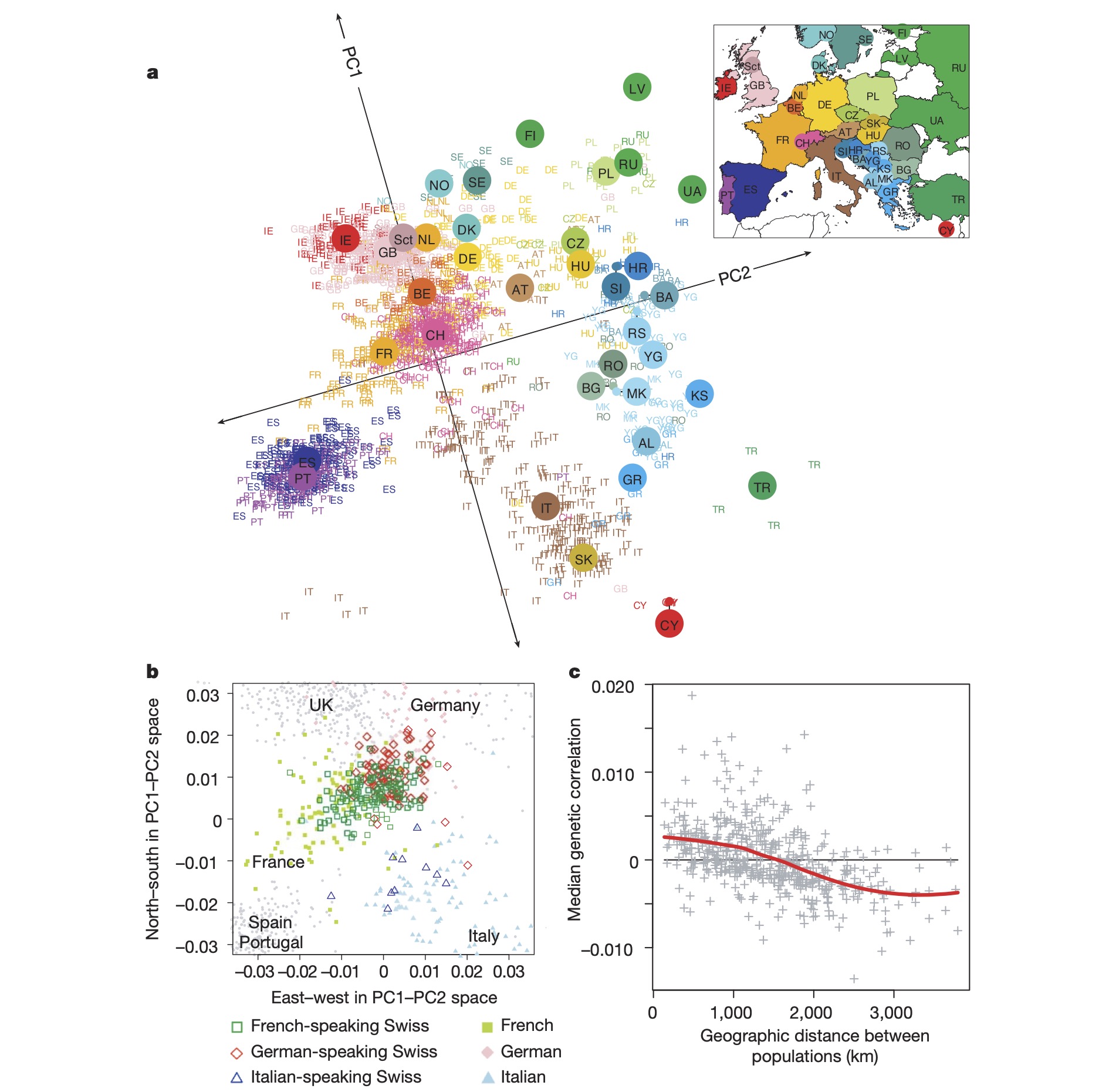
Figure 8. A PCA plot of human populations from Europe. Each point is an individual, and they are coloured by the country they come from. Small coloured labels represent individuals, and large coloured points represent median PC1 and PC2 values for each country.
5.2 Question 2. Understanding populations from DNA
- Outline how population genomic data are collected; starting with the collection of samples from individuals, laboratory work, and the data analysis steps to obtain a VCF file containing SNP data.
- Name and briefly explain three methods to display population genomic data to show genetic relatedness (population structure) between individuals. For each method, give one strength and one weakness.
- List three features of the genetics of natural populations that we can learn from population genomic data.
5.2.1 Model answers
- Outline how population genomic data are collected—starting with the collection of samples from individuals, laboratory work, and the data analysis steps to obtain a VCF file containing SNP data.
Answer:
Blood, tissue or whole organism samples are collected from individuals in the region and species of interest. Ideally, we would obtain tens to hundreds of samples. We then extract DNA from these samples in the laboratory. DNA is sequenced using a high-throughput sequencing platform, such as Illumina. Reads are then mapped to a reference genome, and variants (SNPs) are called using variant-calling software. The output is a VCF file containing SNP data for all individuals.
- Name and briefly explain three methods to display population genomic data to show genetic relatedness (population structure) between individuals. For each method, give one strength and one weakness.
Answer:
Method 1: phylogenetic tree. Strength: Shows populations and relatedness clearly. Weakness: Performs badly with hybrids, or other complex situations.
Method 2: principle components analysis (PCA). Strengths: Shows hybrids well. Can sometimes show population geography patterns. Weakness: Does not show direction of evolution as phylogenetic trees do, nor quantitative information about timing of events that we can obtain from phylogenetic tree branch lengths.
Method 3: STRUCTURE plot. Strength: Shows hybrids well, and can distinguish species that do not appear to hybridism. Weakness: Does not show the genetic distances or relatedness between individuals or populations very well.
- List three features of the genetics of natural populations that we can learn more about from population genomic data.
Answer:
- Population structure: by identifying genetically similar individuals, we can define populations within a species.
- Migration: by identifying genetically similar individuals in different locations, we can infer migration between populations.
- Hybridisation: by identifying individuals with mixed ancestry from different populations or species, we can determine if hybridisation is occurring, or the populations are isolated.
- Selection: by looking for genomic signatures of selection, we can identify genes or genomic regions that are under selection in natural populations.